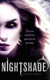
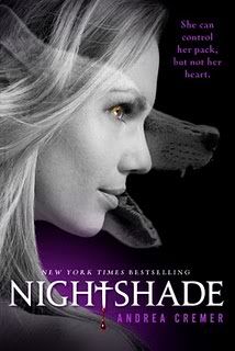
I love it! I love also that it matches the original cover for Nightshade, the first book in the series.
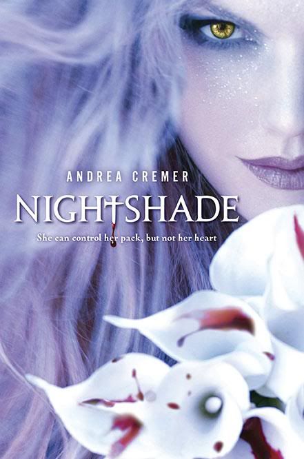
I have to admit, that I like the UK cover for Nightshade even better, though. I like the slightly darker hue (more appropriate for the story, I think) and I like the vegetation-inspired font better.
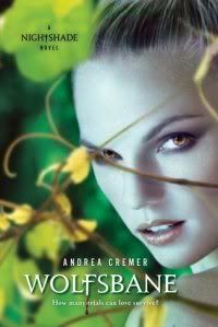
Just for fun, let's take a look at a couple more cover designs. Here is what was probably an early design for the paperback edition of Wolfsbane, as it has the same cheesy tagline as the first book, "She can control her pack, but not her heart."
I like the font better, but I can't say that I care for the way they've cropped the photo. Without seeing the forest around her, it makes the yellow flower near her eye look a little more random. Like, is it supposed to be part of her hair, or what? Photoshopping out that branch that whips across her face has made the whole picture look blurrier than it should. And I don't like the way the tagline covers her whole forehead. On the whole, it's not a bad cover though.
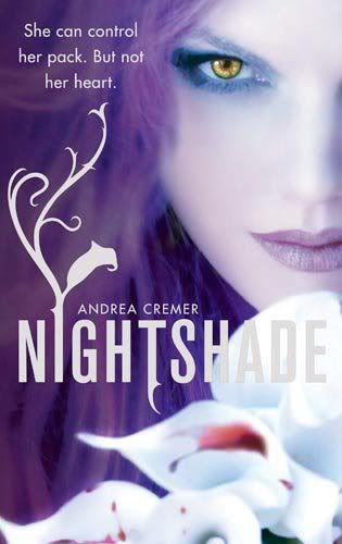
And here's another design I found and I'm not quite sure where it's from. Maybe it's an early Australian version of Nightshade? I thought that the Australian cover ended up being the same as the UK cover.
Okay, brace yourselves. This is the new cover, which is designed to match the new paperback cover for the first book in the series.

Ugh! I can't stand it. This picture looks so bad. They're worse than the Vampire Academy or House of Night covers and that's saying something. I would be embarrassed to be seen reading this.
What do you think? Which cover do you prefer?
These new covers just make me sad, they lack all the interesting elements of the original covers and are now very generic looking. Wolfsbane I think is particularly bad, I don't understand why she's in that strange open-legged squatting stance. I adored both the original covers, they were vibrant and eye catching!
ReplyDeleteNo, what was wrong with the old covers? They were so pretty!
ReplyDelete@Jenny I know it. It looks like she's trying to a split and failing... or she's trying to strike some sort of stripper pose? I don't like the mix of the black and white photo and different color backgrounds. I don't like the wolf snout superimposed on the first cover. I don't like anything about it!
ReplyDeleteThe first of the new covers looks like a dressed up playboy pose. The lack of creativity is pathetic. I'm so glad I have Nightshade in is original purple awesomeness.
ReplyDeleteI like the way the girl looks in the new covers. I haven't read the books yet, but she looks a lot like how I picture the character from the blurbs. But that's about all I like about the new covers.
ReplyDeleteThey're just boring and embarrassing. They look like cheesy adult paranormal fic. The old covers were truly beautiful. They were the types of covers I would want to hang on my wall. Why in the world would they change them??
Don't want to be rude but I love both covers! Wolfsbane is a symbol of how she is about to pounce on something and kill it, like a wolf. The pose she is using is a freaking crouch, ready to spring at a moments notice. I kind a like the old Wolfsbane but i don't like it how she has her hair up in a pny tail that looks all neat and nice, she's a Alpha wolf. She should have her hair down and a bit out of control.
ReplyDeleteI am new to the book of Nightshades so if some one can please tell me which books come first.Please an thank you...
ReplyDeleteAnd also what I wanted to add on from August 25, 2012 4:02 Pm is that the first book the old cover I love it but it seems to much like a fairy book not a girl that can shapeshift into a wolf. I do like Wolfsbane, i think it would have been cool if they stayed with it but again hair down and a bit wild.
ReplyDelete